You are using an out of date browser. It may not display this or other websites correctly.
You should upgrade or use an alternative browser.
You should upgrade or use an alternative browser.
Could the space figures in top-right corner also show the [deleted items] usage.
- Thread starter cloud9
- Start date
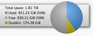
It's the "Used" mouse-over figure in the chart that differs from the title bar version. Hadn't noticed this earlier. Agree with prpr that they should both say the same thing, so really the Dustbin in the title bar should show a percentage also, with the corresponding percentage and GiB subtracted from title bar "Used" figures.
Last edited:

It was like that for me in Firefox till I cleared the browser cache.Well that has buggered up the WebIf on my iPad!
MontysEvilTwin
Well-Known Member
@af123. Loving this pie chart upgrade, but just to be a nitpicker, the top right hand corner of the status box is very close to the colour key for the dustbin. The right edge of the pie chart is further away from the right edge of the banner than the left edge of the Freeview symbol and status box is from the left edge of the same banner, so this could be changed by moving the chart and legend across a bit. Also, the HD- and HDR-FOXes used to have light blue and green segments, respectively, in line with the Humax charts, signifying internal and USB disks. If you do decide to adopt either, or both, suggestions it is certainly not urgent.
@af123. Loving this pie chart upgrade, but just to be a nitpicker, the top right hand corner of the status box is very close to the colour key for the dustbin.
That actually depends on the width of your browser, but it's fairly close for me too.
The right edge of the pie chart is further away from the right edge of the banner than the left edge of the Freeview symbol and status box is from the left edge of the same banner, so this could be changed by moving the chart and legend across a bit.
The right edge of the pie chart /object/ is the same distance away - you can tell that by hovering over the top right (blue) sector and seeing that the pop-up text extends past the right of the actual chart. That's the reason but I can move both right a bit.
Also, the HD- and HDR-FOXes used to have light blue and green segments, respectively, in line with the Humax charts, signifying internal and USB disks. If you do decide to adopt either, or both, suggestions it is certainly not urgent.
What do people think about this? I was just going to leave it blue for both now.
btw - it is now possible to customise aspects of the pie chart through the EXTRA.css file
for example, add this for a smaller chart:
Code:
#tbdiskpie
{
  width: 100px;
  height: 100px;
}

.tbdiskpie
{
  top: 7px !important;
}
MontysEvilTwin
Well-Known Member
I tend to use Web-If on an Android tablet (Nexus 7) with Dolphin browser: it could well look a bit different on a more common device/ browser combination. Thinking about the colours, I think changing it to green on the HDR would make it harder to distinguish from the yellow of the dustbin so it is probably best to leave it as is, unless you change the dustbin colour as well, of course.

You are right, I had not noticed thisaf123 said:The right edge of the pie chart /object/ is the same distance away - you can tell that by hovering over the top right (blue) sector and seeing that the pop-up text extends past the right of the actual chart.
Thanks, I much prefer the smaller chart.btw - it is now possible to customise aspects of the pie chart through the EXTRA.css file
for example, add this for a smaller chart:
Code:#tbdiskpie { width: 100px; height: 100px; } .tbdiskpie { top: 7px !important; }
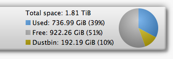
I have the small pie chart, and can easily see the 2% slice that represents my Dustbin.Is there a minimum size of slice visible in the piechart? 5% (52gb) does not seem to register.
It was the same before I reduced the size of the pie.
4ndy
Member
This particular HDR is mostly dustbin, as I copy stuff to my main machine for colating and archiving. It is the main content that is not shown graphically.
The size is not the issue. I have also cleared caches etc.
The main machine is shown correctly on the same browser/computer combinations. I wondered if it is due to the relative size of the dustbin.
Sent from my GT-I9505 using Tapatalk
The size is not the issue. I have also cleared caches etc.
The main machine is shown correctly on the same browser/computer combinations. I wondered if it is due to the relative size of the dustbin.
Sent from my GT-I9505 using Tapatalk
Odd one - @4ndy, can you view the source code of the page and see what the diskspace_data section looks like? It should be near the top.
Code:
diskspace_data = [
   {
     name: 'Used',
     y: 608488886272,
     sliced: false,
     pretty: '743.2 GiB'
   },
   {
     name: 'Dustbin',
     y: 189516447744,
     sliced: false,
     pretty: '176.5 GiB'
   },
   {
     name: 'Free',
     y: 1000438771712,
     sliced: false,
     pretty: '931.73 GiB'
   }
];
4ndy
Member
Odd one - @4ndy, can you view the source code of the page and see what the diskspace_data section looks like? It should be near the top.
Code:
diskspace_data = [
{
name: 'Used',
y: -87510720512,
sliced: false,
pretty: '53.42 GiB'
},
{
name: 'Dustbin',
y: 144872898560,
sliced: false,
pretty: '134.92 GiB'
},
{
name: 'Free',
y: 770637012992,
sliced: false,
pretty: '717.71 GiB'
}
];
[CODE/]
I am guessing the negative used figure is the issue.
Incidentally, HDR2 also has the same issue where usesd =31gb dustbin=169gb.