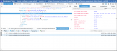
I have this (thanks https://ezgif.com/):
The 17M px high element, new since the Xenforo update.
Scrolling the page.
The 17M px high element, new since the Xenforo update.
Scrolling the page.
Attachments
Last edited:
There have been a few security updates applied over the past few months (not by me but by the company that hosts these servers on my behalf). This is the first that has been visible though.The forum software has been upgraded to v2.2.1, and release details can be found HERE.
Like what? Isn't a thread a thread?we have new forum and thread types
I'm only seeing discussion and poll. Maybe that's because we're in the 'Arms and that's all that's been enabled... so it is.
Ta. I think I like the idea of article type, not sure. We are so steeped in "the old ways" (or at least I am) it's going to be a while before I can get my head around it.The Full Monty, with some quite amusing examples.
We are so steeped in "the old ways" (or at least I am) it's going to be a while before I can get my head around it.
Its an ellipsis (ie a continuation mark) on its side, indicating a continuation to the toolbar. However, I see "hamburger" is used to describe the sub-menu icon comprising three bars (supposed to represent the appearance of a restaurant menu, rather than actually a hamburger), so now I understand the reference.But it sure as hell is easier to write.
Yes. My guess is what it is supposed to do, rather than a statement of what it actually does.As shown in post #7, any adaptation to available width is ineffective.
Its an ellipsis (ie a continuation mark) on its side, indicating a continuation to the toolbar. However, I see "hamburger" is used to describe the sub-menu icon comprising three bars (supposed to represent the appearance of a restaurant menu, rather than actually a hamburger), so now I understand the reference.
...
