Could the space figures in top-right corner also show the [deleted items] usage.

cloud9

Member
Total space: 447.6 GiB
Used: 436.86 GiB (98%)
Free: 10.74 GiB (2%)

Would it be possible to show the [Deleted Items] space here somehow. To give an indication how much might be free soon? I appreciate that that is entirely contained within the Used Space shown, but it is space that could soon be Free space and therefore would be useful to see in that context.
 
It doesn't quite fit cosmetically, but the code would be something like this:
Code:
humax# diff -u /mod/webif/lib/system.class~ /mod/webif/lib/system.class
--- /mod/webif/lib/system.class~
+++ /mod/webif/lib/system.class
@@ -196,6 +196,8 @@
  set used $($size - $free)
  set perc $($used * 100 / $size)
  set fperc $(100 - $perc)
+  set binsize 0
+  set binperc 0
  switch [system model] {
  HDR { set tsrdir "/mnt/hd2/Tsr" }
@@ -211,15 +213,22 @@
  set tsrused 0
  }
+  if {[system pkginst undelete]} {
+  lassign [exec /mod/bin/busybox/du -s [system dustbin]] binsize
+  set binsize $($binsize * 1024)
+  set binperc $($binsize * 100 / $size)
+  }
+
  if {!$raw} {
  set size [pretty_size $size]
  set free [pretty_size $free]
  set used [pretty_size $used]
  set tsrbuf [pretty_size $tsrbuf]
  set tsrused [pretty_size $tsrused]
+  set binsize [pretty_size $binsize]
  }
-  return [list $size $used $perc $free $fperc $tsrbuf $tsrused]
+  return [list $size $used $perc $free $fperc $tsrbuf $tsrused $binsize $binperc]
}
proc {system diskfree} {} {
humax# diff -u /mod/webif/include/diskspace.jim~ /mod/webif/include/diskspace.jim
--- /mod/webif/include/diskspace.jim~
+++ /mod/webif/include/diskspace.jim
@@ -3,7 +3,7 @@
source /mod/webif/lib/setup
require system.class pretty_size
-lassign [system diskspace 1] size used perc free fperc tsrbuf tsrused
+lassign [system diskspace 1] size used perc free fperc tsrbuf tsrused binsize binperc
# Calculate the TSR reserve
set tsrreserve $($tsrbuf - $tsrused)
@@ -38,7 +38,12 @@
  <br>
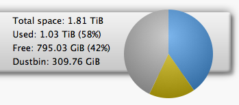
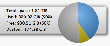
  Total space: [pretty_size $size]<br>
  Used: [pretty_size $used] ($perc%)<br>
-  Free: [pretty_size $free] ($fperc%)
+  Free: [pretty_size $free] ($fperc%)"
+if [system pkginst undelete] {
+puts "<br>
+  Dustbin: [pretty_size $binsize] ($binperc%)"
+}
+puts "
  </span>
"
 
Last edited:
Pretty much matches mine : ) - doesn't look to bad with a bit of style tweaking:

Screenshot%202014-10-14%2020.34.18.png
 
Dare I suggest that for consistency the the dustbin should have its own colour slice in the pie chart?
That's a good idea but the current pie chart just uses the same images as the main Humax firmware. It isn't easy to just add a new slice.
I could completely replace the chart though...
 
I have a test package for hairy_mutley's suggestion:

Old on the left, new on the right.

Screenshot%202014-10-15%2000.24.25.png
Screenshot%202014-10-15%2000.25.58.png


Code:
humax# opkg install http://hpkg.tv/hdrfoxt2/test/webif_1.0.17-4_mipsel.opk

if you want to see how it looks so far...
 
Looks nice. I never really liked the green one. I still prefer mine with the percentage on the Dustbin, for consistency with the others!
 
Looks nice. I never really liked the green one. I still prefer mine with the percentage on the Dustbin, for consistency with the others!
What do other people think? I didn't think it looked right with all of the percentages adding up to more than 100% but I'm willing to be persuaded.

I have tweaked the chart up 10 pixels too in my local copy - I think that makes it look better.. Oh, and my dustbin empty run has just completed!

Screenshot%202014-10-15%2001.01.05.png
 
At least the new pie chart ditches the stupid horizontal colour error in the Humax version. It's a pity we can't fix it on screen too.
 
Liking those new changes! The only other thing I would love to see on the Disk Space listing is the order changed (or changeable) from alphabetic to size consumed, ideally largest first.
 
It would be nice if the Used and Bin texts were coloured to match their pie-slices (subject to still being readable). Otherwise less frequent users have to compare the numbers to work out which is which.
 
It would be nice if the Used and Bin texts were coloured to match their pie-slices (subject to still being readable). Otherwise less frequent users have to compare the numbers to work out which is which.
Tried hovering over the chart? Not sure how it will work for those on tablets...
 
At least the new pie chart ditches the stupid horizontal colour error in the Humax version. It's a pity we can't fix it on screen too.
We could - just need someone to produce replacements for the 25* images it uses.

* could be 26...
 
At least the new pie chart ditches the stupid horizontal colour error in the Humax version. It's a pity we can't fix it on screen too.
I believe that was deliberate on Humax's part, in order to create a floating 3D drop shadow effect.
 
It definitely looks deliberate to me too. Anyone had time to test it in IE?
 
The Used space is now inconsistent as this shows. Perhaps best to make the one on the bar ignore the bin, then they would all add up (even the percentages, hint!)
diskspace.png
Cosmetics still not working for me on the bottom line either.
 
Back
Top