Forum software upgraded!

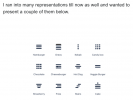
Its an ellipsis (ie a continuation mark) on its side, indicating a continuation to the toolbar.
Usual speak is "kebab" for this continuation icon.

Perhaps the 3 dots should be called a Slider (an American mini-burger)
Sorry. Too late. It is usually called a "kebab".

And why have two hamburgers?
Because there are two continuations.

It's a shame people have to go their own way rather than follow an existing de-facto standard so as to be intuitive.
Please would you expand what you mean by that in this context.
 
I think the reference to me calling a 'kebab' a 'hamburger' rather than the standard 'ellipsis on its side'.
OK. I'll rephrase the other question. Why are there two continuations when, ar my current screen res, there is plenty of real estate to do away with the leftmost one.
 
Please would you expand what you mean by that in this context.
Simples: My impression is that all these symbols mean pretty much the same thing and it's just on the whim of the author or development platform which they use.

I have a lot to do with elderly people (yes, even older than me... or Trev!) - some still bright as a button, others less so - and it is my thesis that the world is becoming / has become a difficult and confusing place for them, not because of modern technology per se, but because modern technology displaces simpler technologies due to market forces. Almost nothing "just works" now without having to boot up, and potentially crash - not even a transistor radio.

I am having enormous difficulty getting one elderly friend, still fully in possession of marbles, to use an iPad, for example. The main reason for this is there are few visual cues what to do - being gesture-operated, you have to know what to do without having the reminder of a menu of options to choose from.

My thesis is that the modern world has been designed by twenty- and thirty-somethings, for twenty- and thirty-somethings, and that age group have little or no appreciation for what it is like to be 40, let alone 80. There must always be a built-in way to get "help" at any stage of operation, and that "help" must not disappear from the screen in a matter of seconds (eg TV menus). A major shift of mind-set is required, because the "movers and shakers" should be designing for their parents and grandparents, in preparation for their own old age.

Even as simple a thing as a coffee shop: is the seating accessible and comfortable? Chances are it is high and/or hard, when the elderly bum can't get up there or has little built-in padding and needs a cushion. Are the cups accessible? Chances are they are huge and too heavy for weakening muscles, and even if small/light enough have a finger grip so small you're lucky if you can get one finger through it let alone three, and relies on strength of grip. These coffee shops don't intend to exclude people, but they are because their designers do not understand.

However, back on topic, another "aid" to comprehension is to limit the number of different symbols one is supposed to know! Does it really matter whether a particular icon means specifically a continuation or a sub-menu? They both do the same thing in effect (some more options appear, somehow), and could be represented by the same icon.
 
For accessibility, have all tools displayed at all times, even if that means having two rows.
Gets difficult on small screens. Between adverts, headers and multiple toolbar rows you can end up with a narrow letterbox of usable space.
 
I was confused yesterday using Google Maps for the first time since a recent update wondering where the hell the options menu had gone as I wanted to refresh my downloaded maps. Eventually discovered (actually had to search online) that the options menu had been rolled into the profile icon and I had to tap on my profile icon to see the settings menu. Change for change sake is a bad idea.
 
Quite. There was someone on this forum a while back pushing for some new acronym rather than the known and understood "USB stick". 🤔
No, I was pressing for standardisation with no obvious standard. Just because you know it as a USB stick...
 
I was confused yesterday using Google Maps for the first time since a recent update wondering where the hell the options menu had gone as I wanted to refresh my downloaded maps. Eventually discovered (actually had to search online) that the options menu had been rolled into the profile icon and I had to tap on my profile icon to see the settings menu. Change for change sake is a bad idea.
Yes. New release of iOS, several weeks before I get used to where they've moved everything. It was ages before I discovered the new place for "turn off content blockers" in Safari, I thought it just wasn't there any more (it's on the menu with an icon that looks as if it's to do with text size). For somebody older, an iOS update could be the last straw that breaks their ability to use it at all.
 
Last edited:
On iPhone/iPad in portrait mode, there are three sets of three dots arranged vertically.
 
Yes, but you are using stupid small screens. I am using a 27 incher on my computer or a 15 incher on my laptop and there is oodles of room for the 6 0r 7 not there by default/at all.
None of the other forums that I frequent using the inferno system 'waste' screen real estate like this on a big screen device.
 
Between adverts, headers and multiple toolbar rows you can end up with a narrow letterbox of usable space.
Adverts? What are they?


I am using a 27 incher on my computer or a 15 incher on my laptop and there is oodles of room for the 6 0r 7 not there by default/at all.
FWIW, ditto on 24" UHD.
My guess is what it is supposed to do, rather than a statement of what it actually does.
 
I am using a 27 incher on my computer or a 15 incher on my laptop and there is oodles of room for the 6 0r 7 not there by default/at all.
Stop boasting about your size!
It looks as though on my laptop if you take away the two kebabs (who knew? I didn't) and replace them with the eight drop down items they'd just about fit.
Adverts? What are they?
Something forum non-supporters or ad-blocker non-users see.
 
It looks as though on my laptop if you take away the two kebabs (who knew? I didn't) and replace them with the eight drop down items they'd just about fit.
My point exactly. I have five items in the left hand kebab and three in the right hand one. Crazy. (or PP scaling)
 
On the previous forum software we had a single Insert pulldown menu with all the spoiler and code insert items grouped together
It makes no sense to have inline code and inline spoiler in one kebab and another kebab for normal code and spoiler inserts
 
Back
Top