-
 The forum software that supports hummy.tv has been upgraded to XenForo 2.3!
Please bear with us as we continue to tweak things, and feel free to post any questions, issues or suggestions in the upgrade thread.
You are using an out of date browser. It may not display this or other websites correctly.
You should upgrade or use an alternative browser.
You should upgrade or use an alternative browser.
Forum software upgraded!
- Thread starter prpr
- Start date
MymsMan
Ad detector
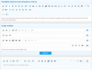
My thoughts are that
- Most commonly used options should be at the left, less used at the right
- There should only be one kebab at the right
- The Medium, Short, Extra Short toolbars should be same as Long but with more items in the kebab section
- We rarely use text size, font, colour, paragraph, media, alignment options so they (and remove formatting) could be moved to the kebab section
- Code, Inline code, Quote, Link are frequently used options
Black Hole
May contain traces of nut
I would prefer to see functional grouping, pretty much as it is now (but maybe with a more obvious division between the groups - more space or a bar).Most commonly used options should be at the left, less used at the right
I don't see why there shouldn't be a kebab per functional group for the more obscure options, although actually I would prefer the whole menu to expand into a second row on user selection so one can survey the whole tool set.There should only be one kebab at the right
Yes, things mustn't shuffle around, if that's what you mean (Windows Ribbon Interface - ugh!)The Medium, Short, Extra Short toolbars should be same as Long but with more items in the kebab section
Speak for yourself. I make extensive use of bulleted and numbered lists, and indentation.We rarely use text size, font, colour, paragraph, media, alignment options so they (and remove formatting) could be moved to the kebab section
Code, Inline code, Quote, Link are frequently used options
Text style section: I would promote underline and strikeout, and demote text size and colour. What does i-code and i-spoiler have to do with text style? - see misc stuff.
Paragraph formatting section: seems OK as it is with the sub-menus (not the same as a kebab).
Miscellaneous stuff: promote code, i-code, spoiler, i-spoiler; demote multimedia and table
Right hand (undo, redo, bb-code, save) as is, no kebabbing (doesn't seem necessary).
Where is the [plain] tool? Is there a [plain] tool?
Black Hole
May contain traces of nut
And what about this damned "article presentation"?
Black Hole
May contain traces of nut
You need to consider a healthier breakfast.
(I've got three kebabs any time of the day)
(I've got three kebabs any time of the day)
MymsMan
Ad detector
I wasn;t suggesting demoting the list/indent menu - I was using a list at the timeSpeak for yourself. I make extensive use of bulleted and numbered lists, and indentation.

But we rarely use centre or right aligned taxt, or different font sizes/colours/styles
Last edited:
Black Hole
May contain traces of nut
Fair enough, it was late.I wasn;t suggesting demoting the list/indent menu - I was using a list at the time
(Taxt?) Such things have to be used extremely sparingly, and might as well not be available at all.But we rarely use centre or right aligned taxt, or different font sizes/colours/styles
Black Hole
May contain traces of nut
Mymsman and I seem to be in near agreement; Trev hates the kebabs but I'm guessing it's not possible to do without them except on a wide screen. I would go for as many tools available one-click as possible (with clear functional grouping), whereas the current arrangement seems to prefer "sparse".Well, if we can come up with a near consensus, I can adjust things (I use markdown pretty much exclusively anyway)
gomezz
Well-Known Member
Why it is that on every modern phone and calling app we still use green and red icons with old-fashioned handset symbols. Many younger people under a certain age will have never ever seen one of these classic telephones. Many homes now do not even have a landline phone at all!
RobH1
Well-Known Member
Mymsman and I seem to be in near agreement; Trev hates the kebabs but I'm guessing it's not possible to do without them except on a wide screen. I would go for as many tools available one-click as possible (with clear functional grouping), whereas the current arrangement seems to prefer "sparse".
I agree.
Black Hole
May contain traces of nut
Yeah, but you missed the main accessibility point: on a non-smart mobile phone the green button turns it on and the red button turns it off, but on a DECT handset the red button turns it on and off (or something like that). Anyway, I wouldn't worry about young people - they're supposed to be adaptable. The problem will be when the young people are the old people (and I'll be past caring).Why it is that on every modern phone and calling app we still use green and red icons with old-fashioned handset symbols. Many younger people under a certain age will have never ever seen one of these classic telephones. Many homes now do not even have a landline phone at all!
Trev
The Dumb One
The problem is present now. Just look at kids behaviour in the shops. No control because the parents wer not brung up proper.,The problem will be when the young people are the old people (and I'll be past caring).
MymsMan
Ad detector
Which has been a recurring complaint of every generation since Roman times, somehow the world muddles onNo control because the parents wer not brung up proper.,
Black Hole
May contain traces of nut
I don't know about that. In all times before now, children were reared in a community with everyone taking an interest and the constant fear that news of any misdeeds would get back to the parents (if not a clip around the ear at the time, from anyone). Now you would have your head bitten off for interfering, and the kids themselves know you can't do anything. I was in a DIY some years ago and a young mother just let her child systematically knock light bulbs off the shelf - and told me to mind my own business. It should be everyone's business.Which has been a recurring complaint of every generation since Roman times, somehow the world muddles on
On the other hand, I grew up with a lot more freedom than there is now and things were less strict, there was much less traffic and danger generally, and less competition and pressure. Lots of mums saw their role as to bring up the children instead of having to generate a second income just to have somewhere to live, and it wasn't generally necessary to cart the kids off with you on shopping trips because you did it while they were at school.
The only thing I use often from the toolbars is smilies, with links, picture attach and bold/italic text less frequent.Well, if we can come up with a near consensus, I can adjust things (I use markdown pretty much exclusively anyway)
From my POV the rest can be skewered

MymsMan
Ad detector
Which has been a recurring complaint of every generation since Roman times, somehow the world muddles on
Dont know the veracity of the quotes

14 Historical Complaints About Young People Ruining Everything
Nothing is certain in this life but death, taxes, and the existence in every generation of fuddy-duddies who carp about things not being what they used to be.
Black Hole
May contain traces of nut
We don't have to host our images elsewhere, so I find that of little use.picture attach
Eh?We don't have to host our images elsewhere, so I find that of little use.


