-
 The forum software that supports hummy.tv has been upgraded to XenForo 2.3!
Please bear with us as we continue to tweak things, and feel free to post any questions, issues or suggestions in the upgrade thread.
You are using an out of date browser. It may not display this or other websites correctly.
You should upgrade or use an alternative browser.
You should upgrade or use an alternative browser.
[webif] Web interface
- Thread starter af123
- Start date
Ezra Pound
Well-Known Member
Web-If EPG Favorite ordering much appreciated 

I second that, thanks very much for doing this. BBC1HD was appearing at the bottom of my list initially but I could see from TBL_FAV that it was stored that way. Correcting that is quite tricky because everything in the Humax on-screen GUI shows it as a continuous loop, so it's tricky to work out where the real 'top' of the list is. I sorted it eventually though. 

Yes, I had thought of adding a bit to the web interface for managing favourites but decided that it wasn't worth the time it would take..I second that, thanks very much for doing this. BBC1HD was appearing at the bottom of my list initially but I could see from TBL_FAV that it was stored that way. Correcting that is quite tricky because everything in the Humax on-screen GUI shows it as a continuous loop, so it's tricky to work out where the real 'top' of the list is. I sorted it eventually though.
Now to get favourites working with RS!
Black Hole
May contain traces of nut
"Save last streamed" does it regardless of whether the download is complete. Do you think we could have a status indication of whether the buffer is still growing, and/or a lock on actioning the save, and/or a deferred save option?
makem
Member
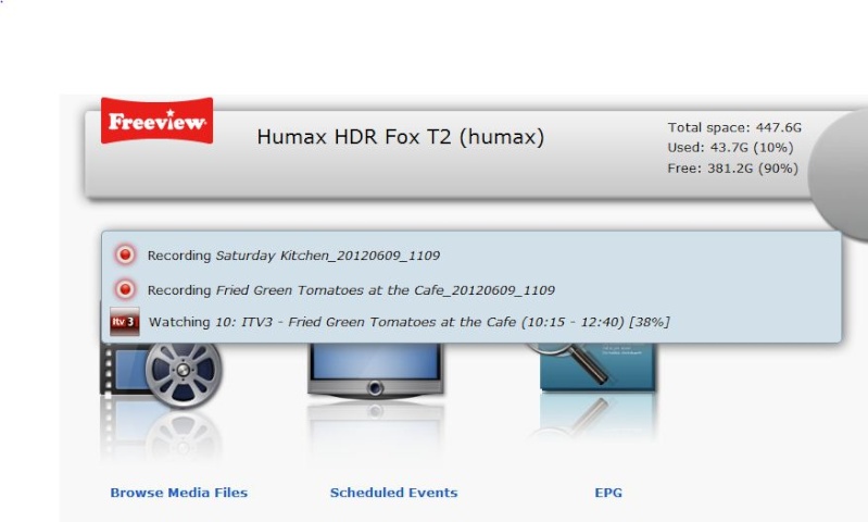
I have just started to notice a pane/element which appears showing what is being recorded and watched a second or two after opening webIF.
This drops down partly over the row of icons below it and just sits there. I cannot see any way of removing it. It is not a problem but is rather untidy. having read it, it serves no further purpose so could be shut.
This drops down partly over the row of icons below it and just sits there. I cannot see any way of removing it. It is not a problem but is rather untidy. having read it, it serves no further purpose so could be shut.
Black Hole
May contain traces of nut
It doesn't normally obscure anything, they should all shove down to make room for it. It shows the current status of the box, so the information is always valid.
makem
Member
It doesn't normally obscure anything, they should all shove down to make room for it. It shows the current status of the box, so the information is always valid.

As I said, I have noticed it recently. Prior to this I did not have any concerns so it must have operated in the manner you suggest. I use the latest Firefox.
That was a fairly recent change introduced at the same time as the drop-down quick navigation bar. There were quite a few complaints about the old version pushing everything on the page down as it appeared.
This version often doesn't obscure anything (when watching a single channel or a single recording) and when it does it doesn't stop you clicking on the menu items. It could be prettier though, I'll have a think!
This version often doesn't obscure anything (when watching a single channel or a single recording) and when it does it doesn't stop you clicking on the menu items. It could be prettier though, I'll have a think!
Black Hole
May contain traces of nut
Sorry, I didn't realise there had been a change.
Just joined the forum after buying an HDR-Fox-T2 a few weeks ago and would firstly like to thank the custom FW developers for their efforts so far.
I'm going to dive straight in and ask for a feature enhancement if that is ok?!
When using the Media list ideally you want to manage and sort your files in a quick and easy manner. Coming from a Toppy+MyStuff background I prefer to view files in a flat structure so the Flatten package is useful to me. The std FW has a strange (to me) sort toggle rather than a sub menu to choose the sort type you want (alphabetic, time or channel). This sort doesn't work well with folders I think, unless it can use the latest file within a folder to use as that folder's 'data' and sort accordingly.
So, am happy with the flattened structure, which allows better (for me anyway) sorting by time or alphabetic (not bothered about by channel).
Then I looked at the De-duplicate/tidy this folder function in Web-If.
Firstly it would be useful to do these 2 things individually, or if they are combined then having the option to select which rows of the file list you want to process.
When I processed the folder (all of the hard drive in the flattened state) I didn't pay enough attention to the file rename suggestions which when using flatten aren't detailed enough. The proposed rename suggestion is geared to a folder structure, i.e. renaming something to 1/6 Glasgow, but losing the title part (Michael McIntyre) as you know that as you are in that folder already. When using flatten it would be really useful to have the title in the rename suggestion.
So, for the second suggestion, is it possible to have a different format of the proposed file rename if flatten is being used? Or have the proposed file rename editable?
Thanks very much.
makem
Member
That was a fairly recent change introduced at the same time as the drop-down quick navigation bar. There were quite a few complaints about the old version pushing everything on the page down as it appeared.
This version often doesn't obscure anything (when watching a single channel or a single recording) and when it does it doesn't stop you clicking on the menu items. It could be prettier though, I'll have a think!
Would it help to have the icons smaller? They are very large.
I like the webIF and Custom Firmware version info - never noticed that before

So, for the second suggestion, is it possible to have a different format of the proposed file rename if flatten is being used? Or have the proposed file rename editable?
While on subject of de-dupe a name format option or similar would be nice, also it changes all spaces to underscores etc. when the Humax seems quite happy to keep spaces. I have actually now started using the webif to do renames manually... stuff like Postman Pat ... so I end up doing:
rename ... highlight episode name in description, paste into description and filename, OK...... wait until screen refreshes, scroll down to the bottom again. Now when you have got 100+ episodes in the same dir this takes a while!
I wonder if there is an easy way for it not to have to redraw the whole screen after every file rename -- gets a bit boring when you are catching up after a few weeks of not tidying up.
Don't get me wrong, completely happy with the new firmware and webif etc. and it makes things SO much easier than the factory one but never hurts to ask !
thanks
Steve
No, it doesn't hurt to ask : ) The screen redraw is just laziness, I should add the code to let the browser do the update in-place.
Dedup replaces spaces with underscores in filenames but not in the programme name that's shown in the Humax media browser. I'm not a big fan of spaces in filenames as it makes working at the command line harder.
Making dedup more flexible has been on my todo list for a long time, I should get around to it but I keep getting distracted.
Making dedup more flexible has been on my todo list for a long time, I should get around to it but I keep getting distracted.
af123, go on, you know you want to!
If you're after some ideas, in order of complexity probably...
1. Separate de-dup and tidy this folder, so users of flatten or those happy with the filenames can use the de-dup alone.
No need for 1. if..
2. Make each row on the output table selectable and editable, so you can 'process' only certain items.
2a. as 2. plus if flatten is being used then change the proposed filename and title to be "Programme: Episode" or similar.
3. Make the tidy this folder configurable. In Settings - have a flag to allow items with status of 'Nothing to do' to be visible or not, or just always make them invisible? In Settings have the title (and proposed filename) configuarable, such as
Part 1 - Programme or Episode title or Episode number
Part 2 - delimeter of space or : or - etc
repeat for each part of the title, even allowing a selectable length for each part (looks like the max length shown on screen for a title is 40 chars?), e.g. Programme, 25, ": ", Episode name, 13. Ok, this last bit might be a bit overkill !
Thanks very much.
0.9.11 (10/06/2012)
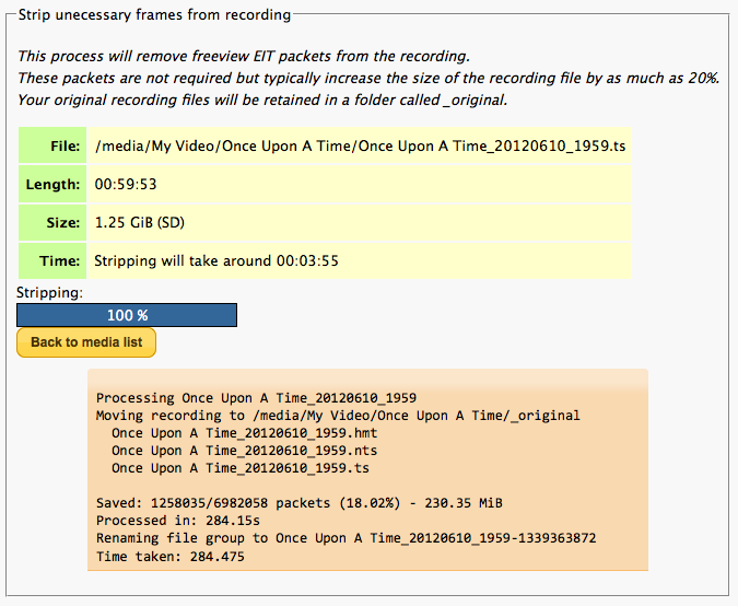
It is still experimental but I have reduced the size of my infamous Octonauts collection by over 3GB!
Please don't remove the original copy of the recording until you've confirmed you're happy with the smaller version.
The process does adjust the index (NTS) file accordingly and trick play seems to continue to work properly but high-speed FF/Rewind can sometimes result in some artefacts occurring that don't appear in the original - hopefully something I can fix in a future version.

- Add experimental support for stripping unecessary frames from recordings to save space;
- Show simpler OPT+ menu for non-native recordings;
- Show Humax software version on front page (with CFW 2.11 and above);
- Fix errors in rendering page footer on non-CGI pages.
It is still experimental but I have reduced the size of my infamous Octonauts collection by over 3GB!
Please don't remove the original copy of the recording until you've confirmed you're happy with the smaller version.
The process does adjust the index (NTS) file accordingly and trick play seems to continue to work properly but high-speed FF/Rewind can sometimes result in some artefacts occurring that don't appear in the original - hopefully something I can fix in a future version.

Black Hole
May contain traces of nut
Very interesting. Engineering management says how about a background shrink utility, much like unencrypt?
Ezra Pound
Well-Known Member
Just a quick Note about the new 'Strip' feature. Don't strip a previously stripped program as it appears to hang with stripping = 0% (even thought it does complete in the same time) and results in a zero size *.nts file, also the new *.ts file doesn't play. I purposely tried this on a file I was going to delete anyway, because sooner or later someone will do this accidentally.
